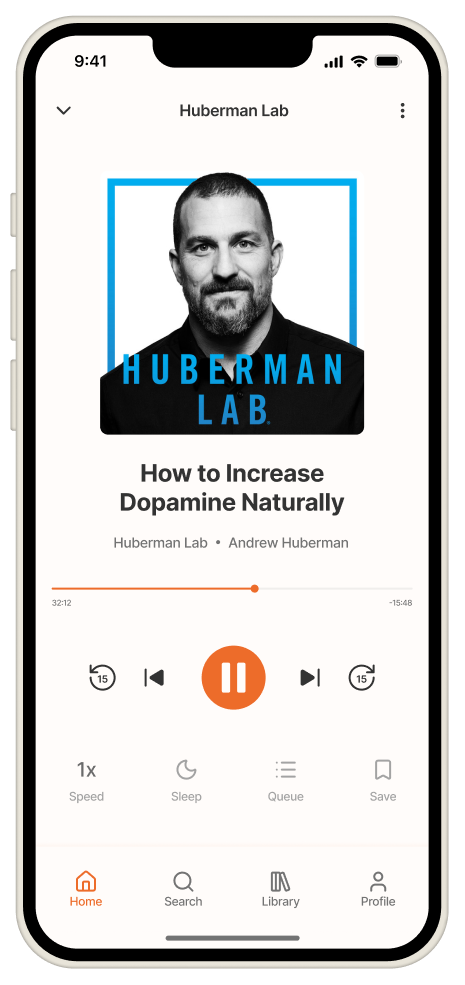
Redesigning Podcast Addict for a Better Listening Experience

A mobile app redesign focused on simplifying navigation, improving content discovery, and creating a more immersive listening experience.

View Prototype
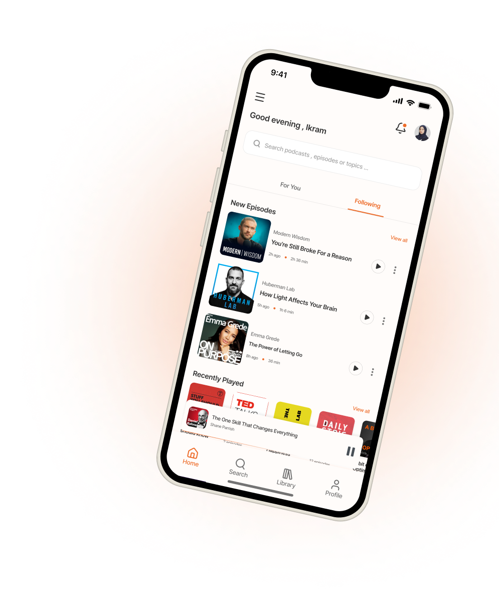
Podcast Addict redesign shown on a phone

Why this project?

Podcast Addict is a powerful app loved by podcast enthusiasts.

However, the experience feels overwhelming for new users due to visual clutter, weak hierarchy, and a feature-first approach.

I explored how the experience could be simplified while preserving its power — putting content and listening at the center.

  • User-first

    Focus on real user needs and listening behavior.

  • Clarity

    Simplified hierarchy and intentional design.

  • Joyful experience

    Make discovering and listening effortless.

Analysis of the Original Design (Key Issues)

First launch (Empty state)
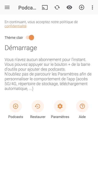
Podcast Addict first-launch screen, original design
  • Hidden primary action

    The most important action is buried in the toolbar.

  • Instruction-heavy empty state

    Users are presented with a large block of instructional text instead of being guided through action.

  • No clear starting point

    Focus is on settings instead of helping users listen.
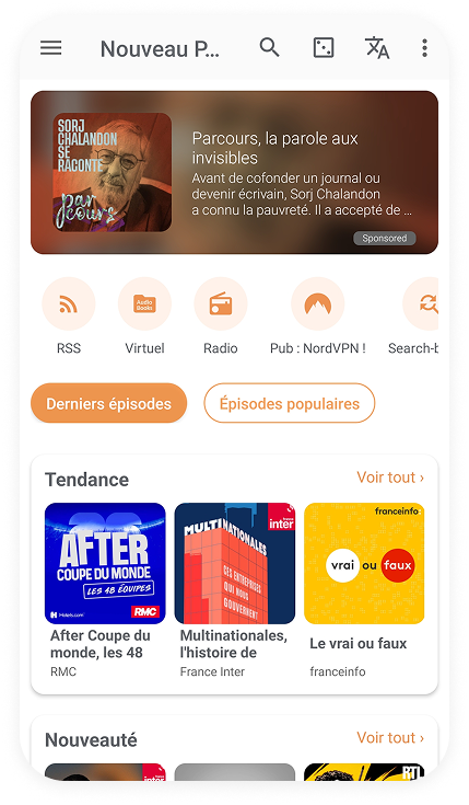
Home / discovery

Podcast Addict home and discovery screen, original design
  • Hidden primary action

    The most important action is buried in the toolbar.

  • Instruction-heavy empty state

    Users are presented with a large block of instructional text instead of being guided through action.

  • No clear starting point

    Focus is on settings instead of helping users listen.
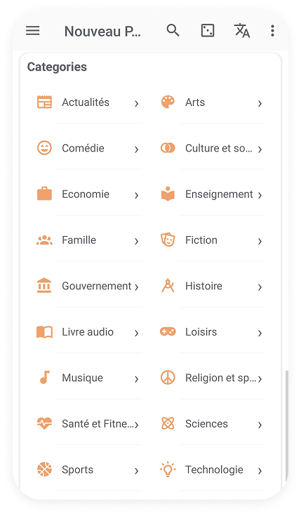
Category browsing

Podcast Addict category list, original design
  • Category overload

    A long list of categories requires heavy scanning and slows down exploration.

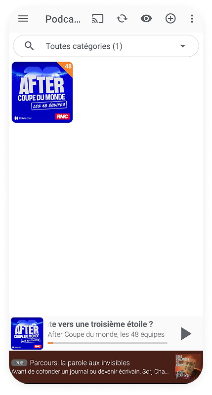
Home with one subscription

Podcast Addict home screen with a single subscription
  • Hidden primary action

    The most important action is buried in the toolbar.

  • Home feels sparse and inactive

    Large empty areas make the Home experience feel inactive rather than content-focused.

  • Intrusive ad placement

    Advertising sits directly above the player, competing with playback for attention.

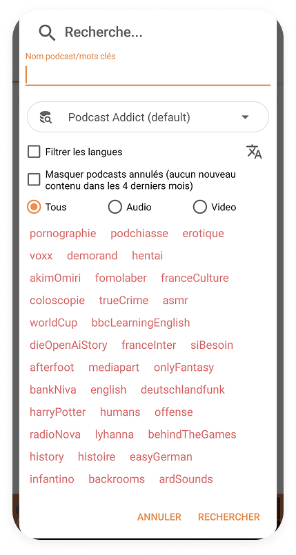
Search

Podcast Addict search screen with advanced filters
  • Advanced filters dominate the experience

    Search begins with technical filtering options instead of helping users find content quickly.

  • High cognitive load

    Multiple filters, toggles and search options increase decision-making before users can search.

  • Poor visual hierarchy

    Search filters and settings receive more emphasis than the search input itself.

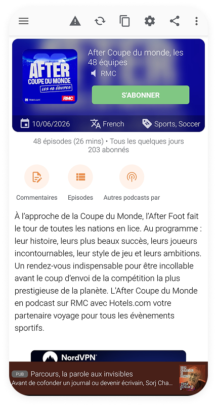
Podcast detail

Podcast Addict podcast detail screen
  • High cognitive load

    Multiple filters, toggles and search options increase decision-making before users can search.

  • Poor visual hierarchy

    Search filters and settings receive more emphasis than the search input itself.

  • Unorganized suggested searches

    Suggested searches are displayed as a long list, making them difficult to scan and explore.

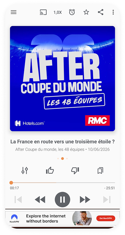
Player

Podcast Addict player screen
  • Feature-heavy interface

    Numerous secondary actions increase interface complexity for a task centered on listening.

  • Playback controls lack visual hierarchy

    The play, skip, speed, timer, cast, and rating controls compete for attention, making it harder to identify the primary action at a glance.

Design Goals

Based on the usability issues, I defined clear goals to guide every design decision.

  • Reduce cognitive load

    Simplify the experience by showing less, focusing on what’s essential.

  • Make podcast discovery effortless

    Help users find the right content quickly and with confidence.

  • Guide attention with clarity

    Use visual hierarchy to highlight what matters most at every step.

  • Keep users one tap away from listening

    Reduce friction between discovery and playback to create a seamless flow.

A simpler, more focused experience

I redesigned the core screens to reduce cognitive load, highlight what matters, and help users discover and listen with ease.

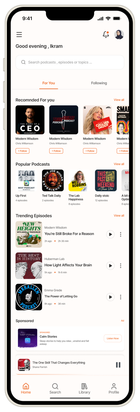
Home (For You)

Personalized discovery at a glance

  • Personalized content first
  • Clear sections and hierarchy
  • Easy access to trending episodes
  • Less clutter, more focus
Redesigned Home screen with personalized recommendations

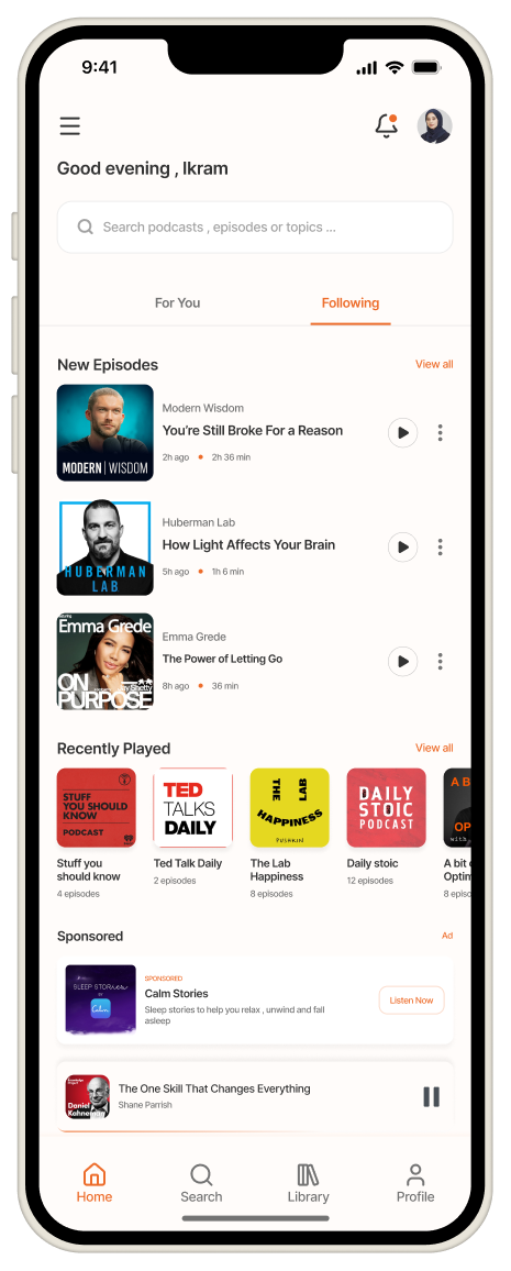
Home (Following)

Stay updated with new episodes

  • New episodes from followed shows
  • Quick overview of recent activity
  • Continue listening seamlessly
  • Cleaner and more organized
Redesigned Following tab showing new episodes

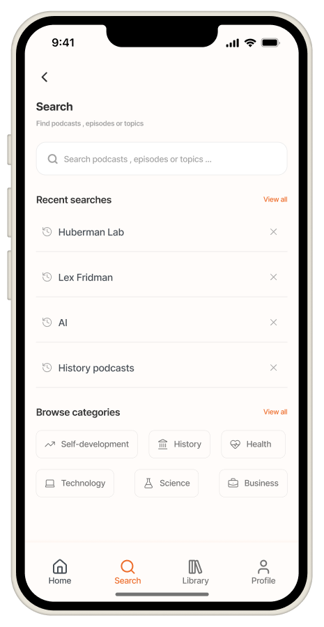
Search

Find content quickly

  • Prominent search input
  • Recent searches for speed
  • Categories to explore content
  • Fewer taps, faster discovery
Redesigned Search screen with recent searches and categories

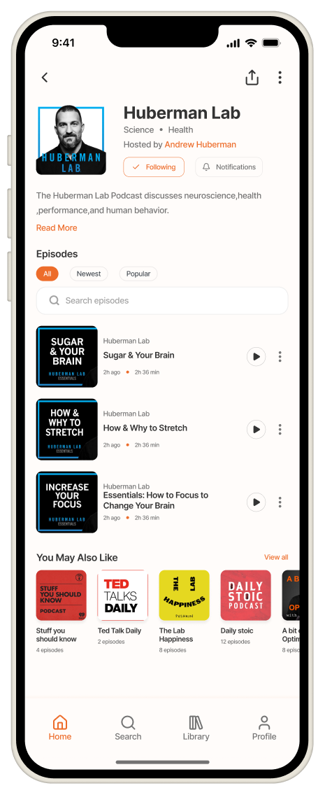
Podcast Details

Focus on the show and episodes

  • Clear podcast information
  • Episodes front and center
  • Easy filtering and search
  • Relevant recommendations
Redesigned podcast detail screen

Player

Clean, immersive listening

  • Focused playback controls
  • Essential actions within reach
  • Distraction-free experience
  • Designed for uninterrupted listening
Redesigned player screen

Expected Impact

  • Faster podcast discovery and easier access to relevant content
  • Reduced cognitive load and user confusion
  • Higher engagement through a cleaner and more intuitive experience
  • Stronger CTA visibility better conversion potential
  • More modern, trustworthy and delightful user experience

What I Would Improve Next