Emploitic

Optimizing a Landing Page for Better Conversion

A landing page redesign aimed at aligning user needs with business goals through clearer messaging and focused CTAs.

View Prototype
Role
UX/UI Designer
Duration
~3 Weeks
Year
Personal Project (Redesign)
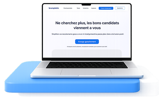
Emploitic landing page redesign shown on a laptop

Context & Goal

Emploitic is a recruitment platform used by companies to find candidates.

The recruiter landing page is critical because it should:

  • Explain the value quickly
  • Build trust
  • Push users to start using the product (conversion)

The Problem

The original landing page lacked clarity, hierarchy, and strong conversion focus, making it harder for recruiters to quickly understand the value and take action.

The Goal

Improve clarity, visual hierarchy, and messaging to help recruiters quickly understand the platform’s value and increase conversion rates.

Analysis of the Original Design (Key Issues)

  • Ineffective Imagery

    Unclear visuals, ineffective design, and poor product communication.
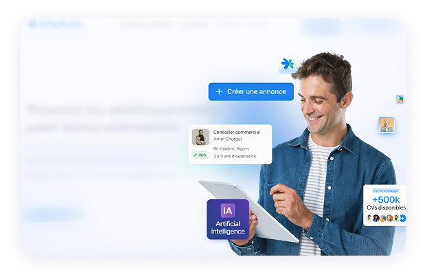
    Original hero section with unclear product imagery
  • Unclear Value Proposition

    The messaging lacked clarity, persuasive impact, and an engaging tone that effectively communicated value to users.
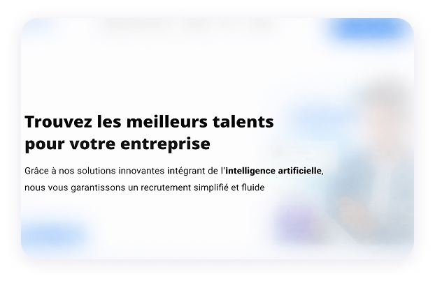
    Original headline and supporting copy
  • Weak CTA Hierarchy and Clarity

    Multiple competing CTAs created confusion, with no clear primary action or visual hierarchy.
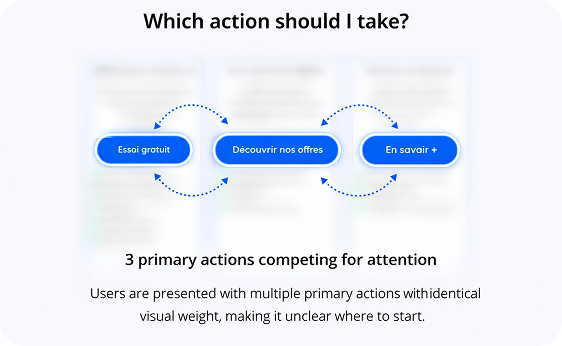
    Three competing calls to action with identical visual weight
  • Cluttered ‘Nos Solutions’ Section

    Dense, unclear content that reduced readability and broke simplicity principles.
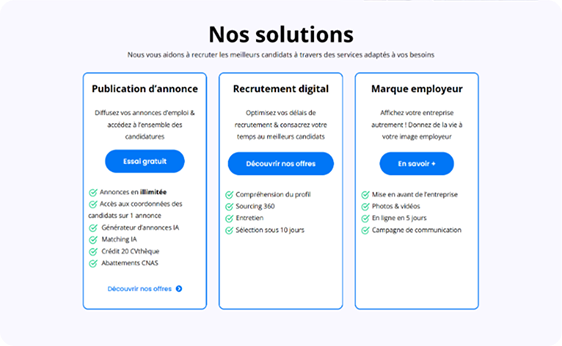
    Dense three-column solutions section

Design Principles

To address these issues, I focused on a conversion-driven and clarity-first approach:

  • Focus on a Single Goal (Conversion First)
  • Modernize the Visual Design
  • Improve Visual Hierarchy
  • Improve Trust & Credibility

The Solution

Hero Refresh: Clarity, Space & Engagement

Before

  • The hero felt cramped and unclear, making a weak first impression.

After

  • Added left and right padding
  • Improved visual hierarchy
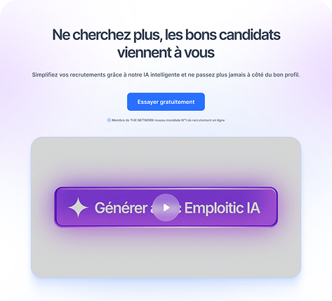
  • Refined the value proposition with a more engaging tone
  • Replaced the generic image with a short explanatory video
  • Made the CTA clearer and more prominent
Redesigned hero section with a clearer headline and single CTA

Reinforced Trust with Social Proof

Before

  • Trust elements were present but not emphasized.

After

  • I added recognizable company logos to reinforce credibility and familiarity.
Trusted-by logo row

Simplified Data & Improved Readability

Before

  • Key metrics were less scannable and visually less impactful.

After

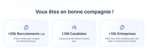
  • Simplified numbers (e.g., 1.5M instead of 1,500,000)
  • Introduced clearer, more engaging phrasing
Three simplified metric cards

Stronger & More Focused CTA

Before

  • Competing CTAs diluted attention and added friction.

After

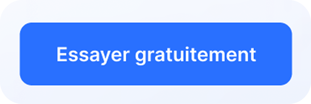
  • Focused on a single prominent CTA (“Essayer gratuitement”) repeated across the page.
Single primary call-to-action button

Optimized Navigation for User Flow

Before

  • The navigation did not effectively support user exploration or decision-making.

After

  • I reorganized the navigation to better align with user intent and progression.
Reorganized primary navigation bar

Restructured Key Value Sections

Before

  • Dense text and a generic layout made it less engaging and harder to scan.

After

  • Replaced dense text with concise, benefit-driven content
  • Made the section more visual and interactive
Restructured value section with a visual example

Expected Impact

  • Faster understanding of product value
  • Improved CTA visibility higher conversion potential
  • Reduced user confusion
  • More engaging and modern experience

What I Would Improve Next